Combine graphomate extensions with Tableau and your business analytics platform data; I’ll show you the benefits and what to look for.
I recommend working out within the company what skills users need to work with data. The SAP front ends, Tableau and Power BI, and open source tools have different focuses. After introducing SAP Analytics Front Ends, Power BI, Python and R, we will explain how Tableau supports the business analytics approach.
SAP and Tableau are seen by many customers as a promising combination for their analytics. In my view, both product families have advantages that suggest such a combination for certain use cases.
SAP has a comprehensive and very powerful offering for integrated data streams with its Analytics product family. Core Data Services (CDS), for example, prepares operational data in S/4HANA so that it can be used out-of-the-box in processes, analytics, and dashboards.
With deep integration across applications, it is easy for us to successfully implement data governance and data protection in the enterprise context. Metadata is preserved from the data sources through the various preparation stages to the display. In my view, Tableau’s strengths lie in the ease with which I can work on accessible data; I have full control over data, display formats, derivations or even combinations. It can quickly overwhelm a beginner, but with a little diligence and practice, even casual users will succeed in working with Tableau. Especially when it comes to new insights, Tableau is appreciated by power users. This is because data sources are difficult to define completely in advance, and “any” restriction is perceived as a hindrance rather than guidance.
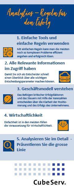
Tableau Software is a manufacturer of visualization software based in Seattle, USA. The software focuses on data visualization and reporting. Tableau Software was acquired by Salesforce in 2019. With Tableau Software products, the focus of data analysis is on visualization.
- Tableau Desktop
Intelligent data analysis and visualization intuitively via drag & drop - Tableau Prep
Combine, format and prepare data for analysis - Tableau Server
Controlled self-service analytics for the entire organization - Tableau Mobile
Data availability from anywhere - Embedded Analytics
Powerful analytics embedded in your own portal
Based on roles, three user types are distinguished:
- Creator (can fully work with the tool and create new data sources)
- Explorer (is limited to the existing data sources; can work with them fully)
- Viewer (data consumer: sees the dashboards and analyses)
User-friendliness is at the forefront of Tableau. In data integration, SQL offers users the advantage of quickly designing powerful queries. In the context of SAP HANA, it makes sense to provide these complex data models centrally with Core Data Services (CDS), graphical views or SAP BW/4HANA/Data Warehouse Cloud.
R is the industry standard for statistics and data mining. Working with R in the console is perceived as complex. Tableau makes it faster and easier to see patterns and build practical models with R. R helps make complex calculations simple. The script is inserted as a calculated field and can then be used as any other function.
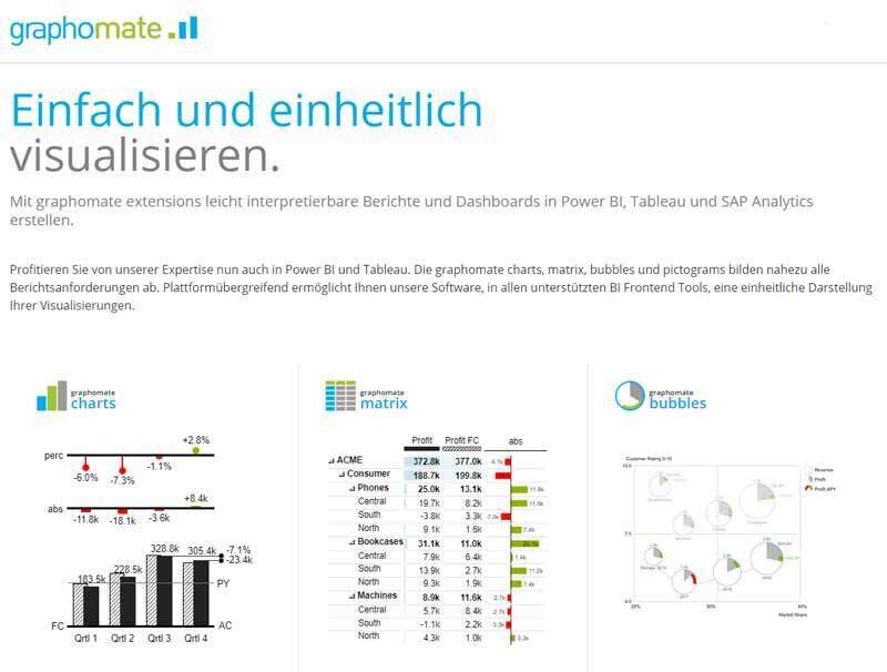
graphomate helps to implement IBCS in Tableau. The components of graphomate for Tableau offer a great added value, as IBCS compliant visualizations become possible with a few mouse clicks.
Combine the graphomate extensions with Tableau to visualize quickly and easily.
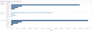
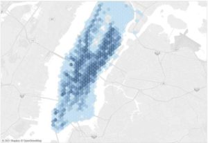
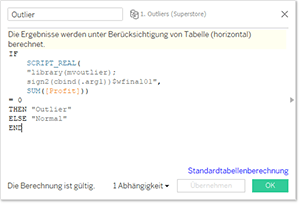
Tableau helps you make sense of your data by letting you decompose, filter, and aggregate it in just a few clicks – optimizing your models before you write a line of code.
Communicating your results is convenient: create an interactive dashboard with dropdowns, sliders, and other visual cues in minutes. Show the full value of your analysis with Tableau.
Tableau complements the business analytics toolset
For a long time, IT departments have tried to satisfy as many needs as possible with just one tool. This approach failed to achieve high user acceptance. What is almost universally unthinkable for the company vehicle is just as bad an idea for the analytics toolset. The tool-zoo should be avoided and still different strengths should be used. With a framework (business analytics platform) the framework is set and the strengths of the products are used specifically: high integration (SAP) and flexibility for the analyst (Tableau). This is how we succeed in providing real added value to our users. We achieve this through the following points:
- Silos in the data warehouse and the data lake are broken down.
- Metadata contains important information to enrich the data and detect inconsistencies.
- Modernize data integration to support hybrid multicloud environments.
- Combine agility and pay attention to scalable solutions through optimized unified data integration.
A typical customer scenario is that standard reporting is designed with SAP Analytics Cloud, Analysis for Office and Lumira. For the group of analysts, Tableau or Power BI are also suitable. Data Scientists work at the console with R or Python, often integrated with Sagemaker (AWS) or Jupyter Notebook.
As long as only the live data connections are worked with, data integrity and privacy is ensured by the data sources (mostly SAP data). You may be familiar with the BARC studies on analytics tools or similar studies by Garnter & Co? Each of the tools listed therein has its specific advantages. Which tool or combination of tools is right for you?
It has proven useful to consider, derived from the objectives, which capabilities you need as a company. In addition to the “objective” criteria, soft criteria such as user acceptance must also be taken into account. CubeServ was allowed to accompany various customers through this process. It turned out that some critical success factors are important for almost all users. Other factors, on the other hand, are company-specific, so that individual target images emerged despite similar requirements.
Why is Tableau so often added to the existing SAP portfolio?
Data analysis with Tableau is simply fun for many users. Tableau has placed great emphasis on the design of the user experience.
Because of its high flexibility to combine data, derive data, etc., Tableau offers its own approach to data exploration. The source data is not modified by Tableau during the live connection, but it is cached locally. Thus, response times after the initial load are excellent. At SAP, the focus is on integration with existing software suites such as S/4HANA. SAP keeps the data in the original location. The reuse of metadata (for example, hierarchies, currency conversions, texts, etc.) is rightly expected by users, but limits independence in analysis.
Business analytics takes a data-driven approach to business, using statistics and data modeling to develop new business insights. This includes analyzing historical data as well as predicting what trends will shape the future, all things being equal, and what business decisions should result.
Data-driven decision making is defined as the use of facts, metrics and data to drive strategic business decisions that align with business goals and initiatives. When companies realize the full value of their data, it means that everyone – whether a business analyst, sales manager or human resources specialist – is empowered to make better decisions every day based on data. This isn’t achieved by simply picking the right analytics technology to identify the next strategic opportunity.
Your organization must make data-driven decision making the norm and create a culture that encourages critical thinking and curiosity. Every meeting should start with data. You develop your data skills through practice and application. This requires a self-service offering where employees can access the data they need, balanced with security and governance. Additionally, the example of leaders supporting data-driven decisions and making them that way themselves is needed. This encourages employees to do the same. In an effort to be data-driven, many organizations are developing three core capabilities: Data Literacy, Analytics Agility, and Community.
NewVantage Partners recently reported that 98.6 percent of executives say their organization is striving to achieve a data-driven culture, while only 32.4 percent report success in doing so. A 2018 IDC study also found that companies have invested trillions of dollars in modernizing their business, but 70 percent of those initiatives failed because they prioritized technology investments without building a data culture to support them.
Storytelling with data
When you present your insights in visually compelling ways, you have a better chance of influencing the decisions of senior leadership and other employees.
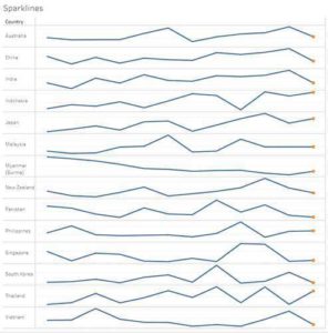
With many visual elements such as charts, graphs, and maps, data visualization is a viable way to see and understand trends, outliers, and patterns in data. There are many popular visualization types to effectively display information: a bar chart for comparisons, a map for spatial data, a line chart for temporal data, a scatter plot to compare two measurements, and more.
Develop insights: Thinking critically with data means finding insights and communicating them in a useful, engaging way. Visual analytics is an intuitive approach to asking and answering questions of your data. Discover opportunities or risks that impact success or problem solving.
Act on your insights and share this way of working (analyze first, then conclude and move into action): once you discover an insight, you need to take action or share it with others for collaboration. One way to do this is to share dashboards. Highlighting key insights through informative text and interactive visualizations can influence your audience’s decisions and help them take more informed action in their daily work.
Combine Tableau with graphomate Extensions. It’s so easy to create consistent and understandable charts.
Further development of the Enterprise Data Model
Before I get to the communication standards and a way to present this similarly across tools, I want to talk about the evolution of the Enterprise Data Model.
In my eyes, Tableau has its strengths in the independent preparation, analysis and playful development of dashboards. Therefore, to ensure sustainable use of the data, it is important that stable insights are fed back into the Enterprise Data Model.
This ensures that there is a single source of truth for the enterprise data model. In my view, the extra effort is absolutely worth it. As far as possible, the data sources in the enterprise data model should be used directly (live data connection) and this very model should be expanded and maintained as new insights are gained.
The single source of truth and a common understanding of definitions and data quality is the basis for a data-driven enterprise. Presenting insights in a user-friendly way with storytelling makes it very easy for users to understand and integrate the insights into their daily actions. A consistent understanding to visualize dashboards, graphs, and tables helps users quickly navigate and avoid misinterpretation.
IBCS – A Notation Concept for Comprehensible Communication
Rolf Hichert reached many controlling departments with his notation proposal. These were introduced into the International Business Communication Standards (IBCS®) and are today significantly developed further by the IBCS Institute. The SUCCESS formula of the IBCS® includes rules for the following three areas:
- Conceptual rules help convey a clear message by building an appropriate storyline. These are the SAY and STRUCTURE sections of the SUCCESS formula, based on work by authors such as Barbara Minto.
- Perceptual rules help convey the message by using an appropriate visual representation. These are EXPRESS, SIMPLIFY, CONDENSE and CHECK of the SUCCESS formula.
- Semantic rules help to convey an unambiguous message by using a consistent notation. This is the UNIFY part of the SUCCESS formula, originally developed by Rolf Hichert.
Because of the formal rules on how to build charts and diagrams, it is easy to overlook that this is just the basis for making the message the focus of a presentation or report.
IBCS® recommends:
- The message should be the answer to the questions posed by those reading or listening. Therefore, those reporting need to know what the readers or listeners are burning to know.
- Each chart is given not only a title but also a message in the form of a declarative sentence. A picture is there to explain the message, but not the other way around.
- Each text passage begins with a summary of the message, namely the most important statement or finding.
- Every report begins with a summary of recommendations, decision statements, or key findings.
- Even a more comprehensive presentation should be able to be summarized in one sentence(!).
- Messages are always complete sentences, they can be findings, statements or recommendations.
The message is what distinguishes reports and presentations from statistics.
Information absorption during listening and reading can be significantly accelerated and facilitated if a uniform notation is used, as with maps, sheet music or technical drawings. Every report object – and this does not only apply to diagrams – should be used with a uniform meaning. This applies not only to colours and shapes but also to fonts, frames, borders, backgrounds, symbols, etc.
I do not want to go into the details of notation rules here. This would go beyond the scope of this blog post. Important further suggestions can be found on the IBCS® website, where you will also find further reading.
I support the suggestion of using notation rules to facilitate understanding of the data, the graphic, and the message. As with so much in life, you need to invest a bit in learning and practising rules in the beginning. CubeServ is happy to offer a workshop on this.
Business Information Design will help you develop a solution tailored to your needs.
If you don't say what you have to say, you won't be understood.
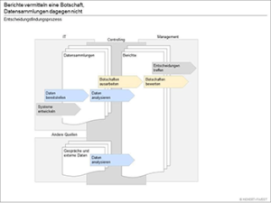
The extensions of graphomate help to implement notation concepts quickly and consistently
With a creative tool like Tableau, notation rules help to focus on the message.
Especially with the extensions of our partner graphomate it is very easy to apply notation rules once they have been defined. Personally, I particularly like the platform idea that graphomate consistently implements in its products. No matter if the extension is used for Microsoft, SAP or Tableau, similar results can be created through a very similar user interface.
I like to use the extension for Tableau, be it to prepare diagrams IBCS®-compatible or to quickly format tables.
CubeServ has been using graphomate extensions for many years. In all these years graphomate has shown itself to be a reliable and innovative partner.
You are currently viewing a placeholder content from YouTube. To access the actual content, click the button below. Please note that doing so will share data with third-party providers.
More InformationThis blog is part of a series of posts on business analytics. I recommend building a business analytics platform. The goal is to provide users with a platform for their needs, where they can find all the data and analytics tool.
Published so far:
- Part 1: How to make business analytics successful?
- Part 2: Business Analytics vs. Business Intelligence
- Part 3: What is SAP Analytics? The SAP Data Warehouse Portfolio
- Part 4: SAP Analytics – The Front End Products
- Part 5: Data Platform – An Important Pillar of Digital Transformation
- Part 6: On the way to AWS
- Part 7: Cloud – Curse or Blessing?
- Part 8: Leading with data – why Power BI is often a choice
- Part 9: Business Analytics Platform: Agility and Data Governance
- Part 10: Advanced Analytics with SAP and R
- Part 11: Data model-driven development with SAP PowerDesigner
