How can I turn my dashboard into an irresistible dashboard? Benedikt Bleyer (CubeServ Group) and Lars Schubert (graphomate) gave us some ideas at the 19th CSC in Zurich. Everyone is looking for the wow effect, so I would like to pick up on these topics.
I am absolutely convinced that decisions are the key to entrepreneurial success or failure. The question now is, on what basis do you make an entrepreneurial and strategic decision? You are dependent on the data, how it is prepared, and how it is read. And what answers you recognize to your questions in the dashboard. Therefore, in my opinion, there is nothing more important than preparing the data for users as transparently, effectively, and efficiently as possible. Condensing the data cloud into clear messages.
We create facts so that you can relax and let your gut feeling make decisions.

A dashboard is a powerful tool that consolidates and visualizes data in a clear and concise manner to provide valuable insights to business analysts. In this article, we will discuss the key aspects of creating an effective dashboard and explore the benefits of using SAP Analytics Cloud Unified Story with AddOns as a reliable solution for dashboard development.
Understanding dashboards and their importance
A dashboard is a visual representation of data that displays key performance indicators (KPIs) and other relevant metrics in an easy-to-understand format. It enables business analysts to monitor trends, identify patterns, and make data-driven decisions. Dashboards are essential in the business world for the following reasons:
- They provide a snapshot of company performance.
- Track progress towards goals and objectives.
- Facilitate data-driven decision-making.
- Improve communication and collaboration between teams.
- Save time by simplifying the presentation of complex data.
Six essential elements
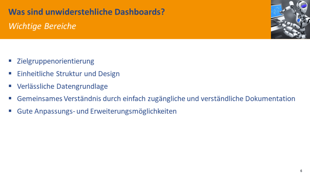
An irresistible dashboard is one that engages the viewer and communicates important information effectively. There are six main elements that are helpful in creating such an overview:
- A focused message that ensures the purpose of the dashboard is clear and easy to understand.
- A clear and concise structure to present the data in a visually appealing way and avoid information overload.
- A comprehensive data basis that ensures that all relevant metrics and KPIs are included and provide a complete picture of the situation.
- Good customization options that allow the dashboard to be adapted to the specific needs of different users and industries.
- Enhancement options, such as advanced analytics and interactive features improve the dashboard’s capabilities and allow users to gain deeper insights from the data presented.
- Storytelling in business presentations is crucial as it helps to captivate, persuade, and inspire the audience. By embedding data and facts into a story, complex information becomes easier to digest and understand.
By addressing these six key points, the dashboard becomes an irresistible tool for decision-makers looking to harness the power of data-driven insights.
Clean, clearly laid out structure
A clear and concise structure is essential for a dashboard to improve readability, facilitate navigation, and allow users to quickly grasp the most important information. A clear dashboard allows the viewer to focus on the key performance indicators (KPIs) without being overwhelmed by excessive visual elements or data points.
Recommended dashboard structure:
- Headline: Start with a concise and informative headline that summarizes the purpose and main focus of the dashboard. This helps to create context for the viewer and draw their attention to the most important aspects of the dashboard.
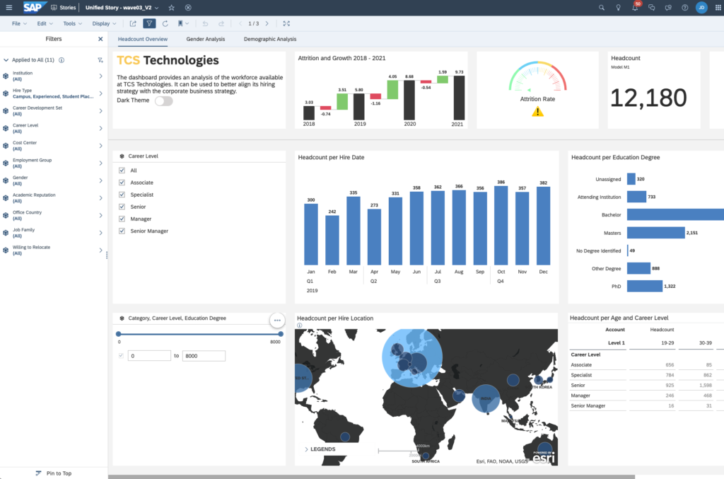
- Filters: About a fifth of the left-hand area should be reserved for filters. Filters allow users to customize the view and focus on specific data subsets that are relevant to their needs. By placing the filters on the left-hand side, you create a consistent and easily accessible place where users can refine their data exploration.
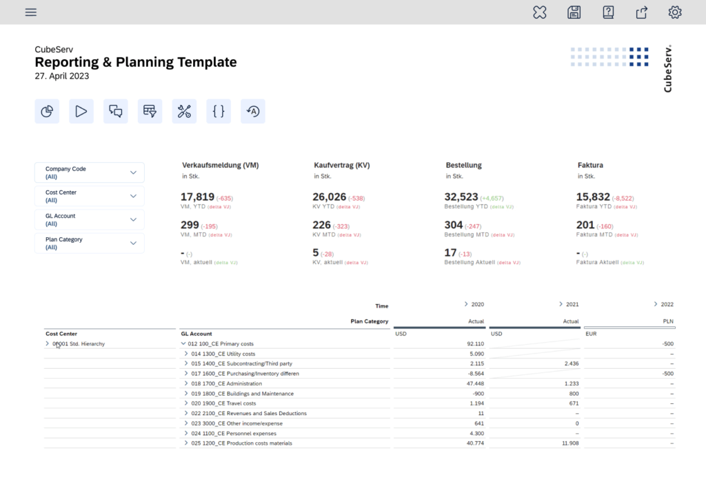
- Central area – Most important KPI: Display the most important KPIs in the first line of the central area. This draws the viewer’s attention to the primary KPI and emphasizes its importance. Prominently displaying the KPI ensures that users can quickly assess the current status and make informed decisions.
- Supporting charts: Supplement the main KPI with a maximum of four charts that provide additional context and insight. These charts should be placed below or next to the primary KPI to maintain a clear layout while allowing for deeper analysis. Limiting the number of charts reduces clutter and helps users focus on the most important information.
By adhering to this recommended dashboard structure, you’ll create a visually appealing, easy-to-navigate, and informative tool that effectively communicates the most important data. A clear design ensures that users can efficiently access the information they need to make data-driven decisions and improve overall business performance.
Dashboard toolbox
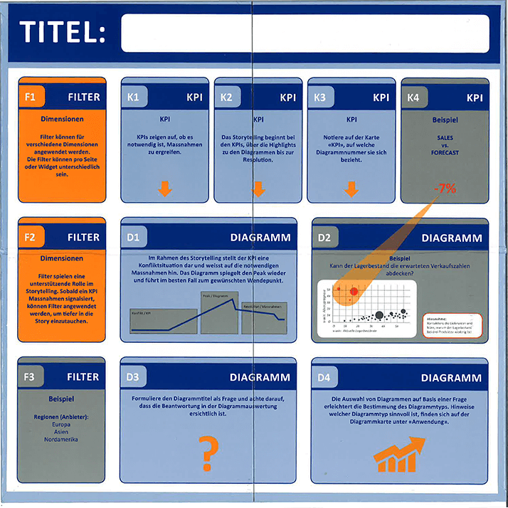
Using a wireframe as a physical development tool for dashboard construction, as created by CubeServ, is an excellent starting point for several reasons:
- Efficient design process: Wireframes provide a visual representation of the layout and structure of the dashboard. They allow developers to quickly plan and arrange elements before getting down to detailed design work. This saves time and resources as adjustments and iterations can easily be made in the initial planning phase.
- Template consistency: A wireframe-based kit ensures that all dashboards follow a consistent template, promoting uniformity and usability across multiple projects. This consistency improves the user experience, as users can easily navigate and interpret the information on the different dashboards without additional training or support.
- Clear organization of elements: Wireframes help developers organize individual elements such as filters, KPIs, and charts within the dashboard in a meaningful way. This organization contributes to a clean and clear layout that makes it easier for users to access and understand the data presented.
- Versatility of chart types: By incorporating different chart types into the wireframe, developers can choose the most appropriate visualization method for each data set. This flexibility ensures accurate data representation and helps users derive meaningful insights from the visualizations.
- Collaboration and communication: Wireframes serve as a tangible reference point for team members and stakeholders during the development process. They facilitate clear communication and collaboration and ensure that everyone involved has a common understanding of the structure and goals of the dashboard.
- Reduced development time: Using a wireframe construction kit streamlines the development process as it provides a predefined structure and format. This speeds up the creation of new dashboards and allows teams to deliver high-quality results faster.
To summarize, the use of a wireframe-based toolkit, as developed by CubeServ, is an extremely effective approach to dashboard development. It ensures efficiency, consistency, and clarity, promotes collaboration, and shortens development time. With this strategy, teams can quickly create highly functional and visually appealing dashboards that enable informed decision-making and improve overall business performance.
Comprehensive data basis
SAP software is used in many companies to manage business processes and generate valuable data. To fully evaluate this data, the entire context must be taken into account, including hierarchies, document flow, currency conversion types, and assigned authorizations. As this context is often not known at the time of data generation or extraction, it is crucial to capture it as comprehensively as possible – a strength of the SAP stack.
When selecting data storage and data preparation solutions, it is important to take this context into account. However, it should also be noted that not all dashboards need to be based exclusively on SAP technology. For many customers, a hybrid architecture, as seen in the Business Analytics Platform, may be more suitable.
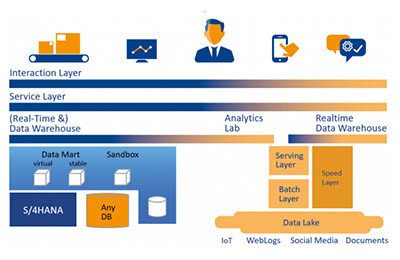
A hybrid architecture combines the strengths of SAP’s contextual capabilities with other data visualization and analytics tools to provide a more flexible and adaptable solution for different business needs. In cases where the added value is there, using SAP Data Warehouse Cloud (or SAP BW/4HANA) in conjunction with SAP front-end tools makes a lot of sense. These solutions provide a comprehensive context and seamless integration with existing SAP systems.
However, there may also be use cases where the SAP stack adds no value and is perceived as unnecessary complexity. In such scenarios, companies can opt for alternative data storage and visualization solutions that best suit their specific requirements.
In summary, while the SAP stack provides a valuable context for comprehensive data analytics, it is crucial to assess the individual needs of each customer and consider the potential benefits of a hybrid architecture or alternative solutions. With a tailored approach, companies can optimize their data storage, preparation, and dashboard development processes. This ultimately leads to better decisions and improved performance.
Good customization options in the SAP Analytics Cloud
SAP Analytics Cloud Unified Story: A game-changer for story designers and developers
If you’re a story designer or developer working with SAP Analytics Cloud, you’re in for a treat. The latest addition to the platform – the Unified Story feature – will revolutionize the way you create and manage data visualizations and analytical applications. In this blog post, we’ll go into the details of this innovative feature and show how it can improve the design process for both story designers and developers.
- Assets and Outline Panels: streamlining the design process
One of the key benefits of the Unified Story feature is the introduction of the Assets and Outline Panels. The Assets panel contains all the widgets that can be added to the story canvas via drag-and-drop, making it incredibly easy to incorporate different visualization elements into your stories.
The outline panel, on the other hand, provides a structured view of all widgets currently available in the story. With this clear view, you can quickly navigate through the different components of your story, making it easier to manage and change them as needed. - Widget configuration: adapt to different contexts
With the unified story feature, story designers can now configure the context menu of a widget to flexibly adapt it to individual needs. This customization allows you to create highly personalized and engaging dashboards that are tailored to specific business needs and contexts. Whether you want to apply a custom theme, add a unique widget, or customize the layout, Unified Story allows you to customize your stories perfectly. - Collaboration: designers and developers working together
Perhaps one of the most compelling aspects of Unified Story is the seamless collaboration it encourages between story designers and developers. By providing an integrated design environment, both groups can work together effortlessly, ensuring smooth communication and teamwork throughout the development process. Designers and developers no longer need to work in separate silos but can work together to create sophisticated and visually appealing stories that enable informed decision-making. - Streamlining the process: a win-win situation for everyone.
To summarize, the Unified Story feature in SAP Analytics Cloud offers a wealth of benefits for both story designers and developers. From the Assets and Outline sections that simplify navigation and organization, to the advanced widget configuration options that allow for context-specific customization, the Unified Story provides a flexible and efficient approach to creating data visualizations and analytical applications. The collaborative environment it fosters further enhances the overall experience, ensuring that both designers and developers work in harmony to deliver impactful analytics solutions.
So if you haven’t tried SAP Analytics Cloud Unified Story yet, now is the perfect time to discover this groundbreaking feature and unlock its full potential for your data visualization and analytics projects. Have fun designing!
Extension options for the dashboard solution
Improve your dashboard experience with SAC extension from graphomate: A one-stop solution for cross-platform consistency
It’s no secret that there are many solutions in the world of data visualization and dashboard creation, each offering its own unique features and capabilities. However, for larger companies, it can be challenging to find a single solution that meets all needs without restricting users. This is where graphomate comes into play. graphomate offers an extension that simplifies the creation of dashboards and ensures consistency between different platforms such as SAP Analytics Cloud, Power BI, and Tableau.
The performance of graphomate
Although extensions may not be necessary for some, graphomate has proven to be a game changer in the field of data visualization. graphomate provides a consistent approach to creating tables, charts, tiles, and comments across multiple platforms. It allows users to maintain a consistent visual language that ensures their dashboards look the same and are built in the same way, regardless of the underlying platform.
This cross-platform consistency is particularly beneficial for larger companies that may have more than one solution in use. Instead of struggling with workarounds and detours to meet specific needs, graphomate provides users with a seamless and efficient experience that makes the dashboard creation process a breeze.
Simplifying the process: A user-friendly approach
The beauty of graphomate lies in its user-friendly concept that keeps the functions and processes the same across different products. This unified approach means users don’t have to re-learn how to create visualizations when switching between platforms – a significant advantage in terms of time savings and productivity.
Final thoughts: Give graphomate a Try
If you want to improve your dashboard creation process and maintain consistency across different platforms, it’s worth considering graphomate. This powerful extension simplifies the creation of visually appealing and informative dashboards while ensuring a consistent user experience. Why not give graphomate a try and see how it can make your life easier? You may find that it’s the missing piece in your data visualization toolkit.
Storytelling
Weaving a story around data and facts makes complex information easier to digest and understand. Here are some reasons why storytelling is important in business presentations:
Generates attention: in today’s fast-paced world, it is critical to capture and hold the audience’s attention. Storytelling captures the audience’s interest and keeps them engaged throughout the presentation.
Creates an emotional connection: Stories evoke emotions that help create a connection between the presenter and the audience. This connection makes it easier for the audience to remember the key points and messages of the presentation.
Simplifies complex concepts: Storytelling breaks down complex ideas into relatable anecdotes and examples, making it easier for the audience to understand and retain the information presented.
Strengthens persuasion: A well-crafted narrative can help influence the audience’s opinion or make decisions. By presenting facts and data within a story, the presenter can influence the audience more effectively.
Increases memorability: People are more likely to remember stories than isolated facts or figures. By incorporating stories into a business presentation, key messages become more memorable and easier to recall later.
Encourages collaboration: A compelling story can inspire team members to take action and work together. It encourages them to work together towards a common goal and thus contribute to the overall success of the company.
To summarize, storytelling is a powerful tool that increases the effectiveness of business presentations. By creating compelling narratives that engage the audience, presenters can create emotional connections, simplify complex concepts, and inspire meaningful action.


To summarize, designing the perfect dashboard is an art that requires a thoughtful approach and attention to detail. By keeping the six key aspects in mind – a focused message, a clean structure, a comprehensive data foundation, customization options, extensibility features, and effective storytelling – you can create a dashboard that not only presents data in a visually appealing and easy-to-understand way but also takes into account the specific needs of your users and your industry. A well-designed dashboard allows users to gain valuable insights and make informed decisions, which ultimately contributes to business success. So as you embark on your dashboard design journey, keep these important tips in mind and strive to create a masterpiece that blends aesthetics, functionality, and storytelling prowess. Your audience will thank you, and you’ll be well on your way to becoming a dashboard design expert!