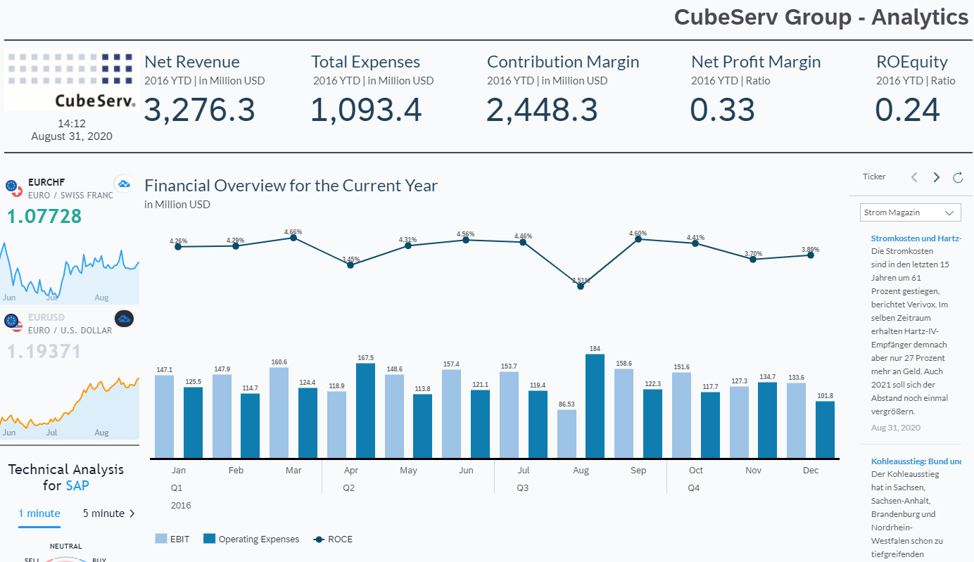
My colleagues and myself have talked a lot about Data Warehousing, Analytics, Reporting, Predictive and Planning in previous blogs and in several Webinars so far this year. However, we have not touched Best Practice in Dashboarding with SAP Analytics Cloud (SAC).
Regardless of the solution, there are many or rather too many features and functions available. This is a big chance but also a risk to “play” around. Apart from the technical side, everyone of us has a unique personal taste. I see this in projects, in our own company and even at home.
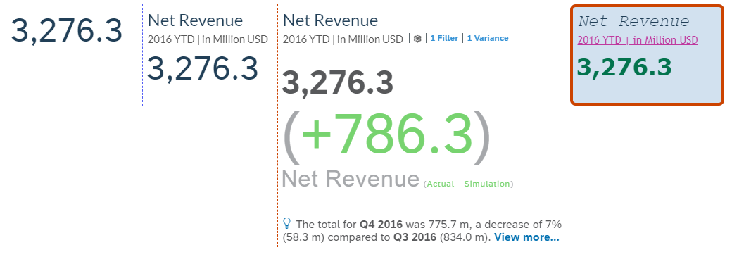
Which of the 4 Numeric Point is your favorite?
If you ask 4 colleagues about the desired Font Size in the Dashboard, you will end up with 5 answers but who is right and who is wrong? The phrase “Beauty lies in the eye of the beholder” is often used but does not solve the challenges and might even hinder the necessary discussions about this topic.
Which of the 3 tables is your favorite?
My aim in this blog is not to convince you of this or that style and design. I want to give you some general advice, some food for thought and some basic principles which will support you in the creation of a suitable guideline and approach to SAC Dashboarding. Even though most of it suits different solutions, my examples will focus on the SAP Analytics Cloud.
It is wise to invest some time in an early project stage to discuss this and to do some prototyping or just start building your first story in the SAP Analytics Cloud in an agile way. This will avoid unnecessary rework at a later stage and establish guiding principles to all future Story builders.
You might have documents covering Corporate Identity and Corporate Design as well as notations standards in place, but do they cover it all?
Notation standards like IBCS (www.ibcs.com), which is quite popular in the D/A/CH region, cover a couple of these topics. SAP Analytics Cloud supports some of the recommended IBCS standards.
Why visualize?
More than 59 ZB (59 billion Terabytes) of data will be created, captured, copied and consumed in the world this year
Ratio of unique data (created and captured) to replicated data (copied and consumed) is roughly 1:9
CAGR through to 2026 is approximate 26%
Amount of data created over the next three years will be more than the data created over the past 30 years and we will create more than three times the data over the next five years than we did in the previous five.
Visualization matters! This survey gives enough reason to think about how we consume and visualize data in a most efficient manner.
Researchers found that
Color visuals increase the willingness to read by 80%
We get the sense of a visual scene in less than 1/10 of a second
Data visualization
Makes it easy to recognize patterns and find exceptions
Enables you to interpret data at faster pace
Allows to analyze challenging data sets
The modern dashboarding tools allow you to get a new, fresh look at your data and gain insights – therefore:
start the design from scratch to get the most out of the tool and do not copy/paste existing reports (Excel, PowerPoints etc.). By doing so you will be able to make full use of the solution’s potential and provide your clientele with a fresh and up-to-date consumer experience.
be aware that it is an agile process, the first dashboard version often needs to be reworked.
What to visualize?
Before you can start with the visualization, you need to know:
Your audience, their expectations and needs?
Self-Service BI
Point of Access
Mobile
On- and offline
Printing
What is my story
What is the content? Start -> Middle -> End
What do I want to tell?
Which questions shall be answered?
Which insights into the data will be given?
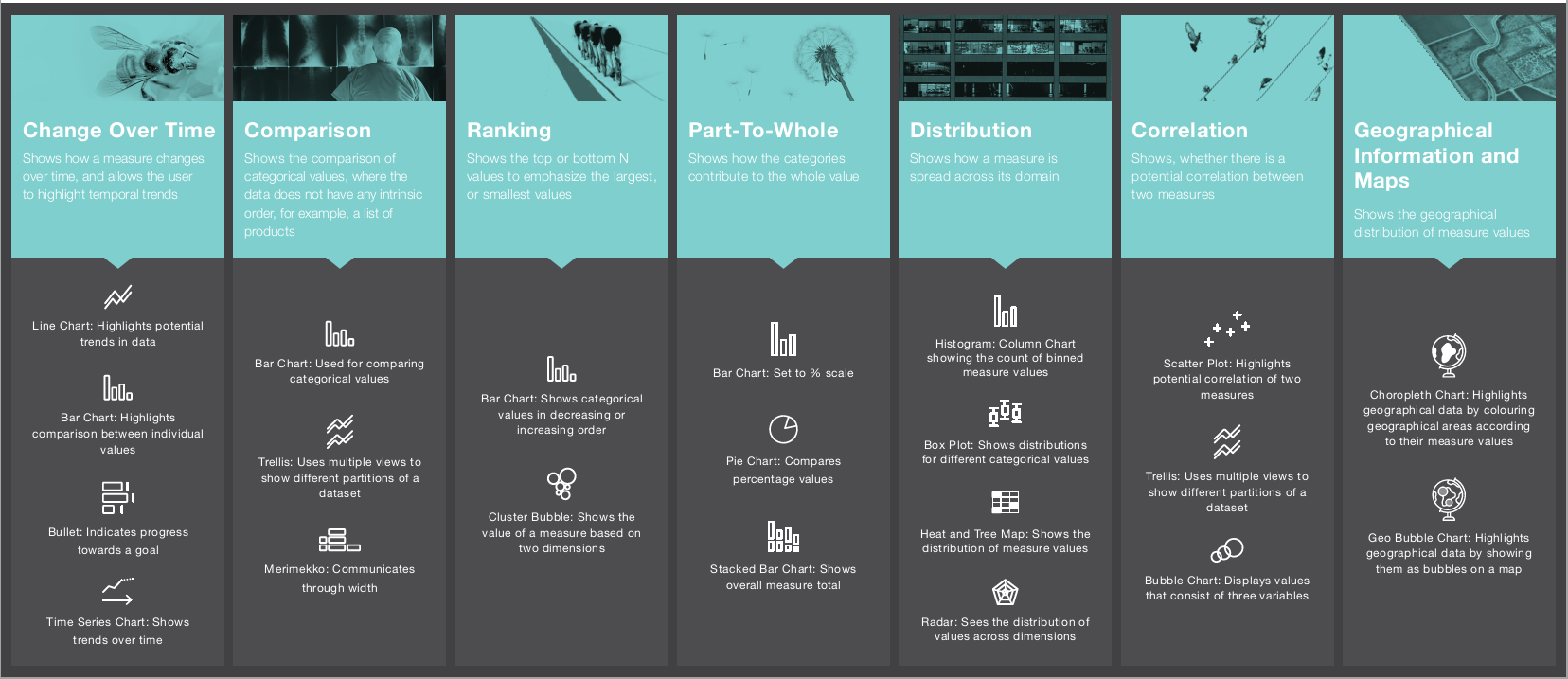
Which visualizations are the best fit?
Your data
Can my data fulfill those expectations?
How do I need to model my data to be fit for purpose?
The greatest value of a picture is … when it forces us to notice what we never expected to see.
Tipps for Stories
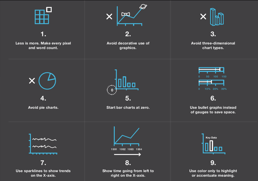
Simplicity remove anything that is not absolutely central to the interpretation of the data.
Stories are not a place for artistic impressions
Most important information comes first
The important charts can be seen without scrolling, make them bold, do not hide the information in charts
Group the interrelated information together, this makes it easier to compare and gives deeper insights
Perfection is achieved, not when there is nothing left to add, but when there is nothing left to remove.
Start with the big picture and then drill down
Create a couple of high-level summary pages and enable the user to drill down for deeper insight
Use thresholds for easier, faster insights
Alignment and logical order of charts
Most important information comes first
We read from left to right and top to bottom, therefore place the widgets accordingly
Align the widgets, clean and fresh look
Use colors when appropriate but sparingly
Use high contrast, what might look good might not clarify the numbers
Use the best, not the prettiest visualization
Context
Make sure that it is always clear what you look at (Selections, Currencies, Time, Units, Legends, Deviations etc.)
Choose the right visualization
Choosing the right visualization will have a big impact on your user side. They must be able to understand, interpret and starting the right actions on the spot. In such a way, you will gain a high adoption and approval ration for your dashboard.
IBCS
Have a look at www.ibcs.com. You will find valuable tips for all sorts of visualization.
A great visual design standard will accelerate understanding and consumptions of your data. It is that simple. For your business to reap the benefits of data visualizations, organizations need to create a visual design standard that incorporates best practices.
The International Business Communications Standards (IBCS), is a non-profit organization that established a rather comprehensive and detailed visual standard for designing both reports and presentations. It is highly recommended that anyone who develops reports, either as a data professional or business analyst, should peruse both the IBCS website (https://www.ibcs.com/) and Rolf Hichert’s consulting website (www.hichert.com)
Visualization with SAP Analytics Cloud
Good Visualization: Story Layout
Initial questions regardless of content
How will the story be consumed? This has an impact on whether to work with Canvas or Responsive Pages (Mobile)
on Desktops / Laptops
via the SAC IOS/Android on mobile devices
in the SAC Digital Boardroom
Shall the story be exported to PDF/Google Slides and be printed?
A4 Portrait or Landscape
Please be aware that the SAC is primarily built for online access and interaction. If you need a highly formatted, printable monthly reporting, you might want to consider SAP Crystal Reports or even SAP Disclosure Management.
Are there Corporate Identity / Corporate Design guidelines to follow? If not, please set up some minimal guidelines regarding
Font & Font sizes for Titles, Subtitles, Widgets
Color schemes
Number Scaling and decimal places
Formatting of different Versions (Actual, Budget, Forecast)
Background color of the story and widgets
Logo (size and placement)
Good Visualization: Content
Obviously, the content is important.
One question which will arise certainly is “How many widgets (Numeric Point, Tables, Charts, etc.) shall I put on one page?”.
That is not so easy to answer but following considerations will assist you:
Are my users willing to scroll horizontally and or vertically?
How is the performance, loading time of my page?
It might be a difference to load 5 widgets based on 5 different data sources to 5 widgets based on one single data source.
Will I work with Story and/or Page filters?
and more…
Design the Storyline and Flow, keep in mind your audience and effective visualization
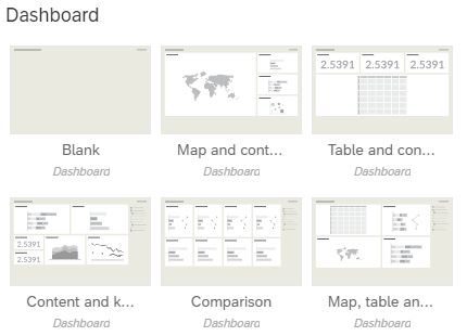
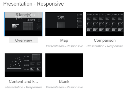
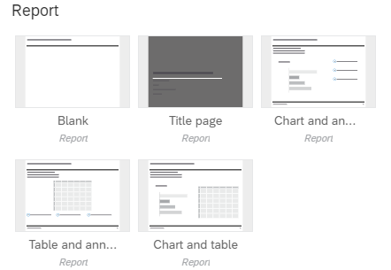
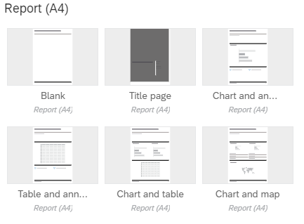
SAP Analytics Cloud Template
The SAP Analytics Clouds comes with several templates for different scenarios. You can create your own templates from scratch and/or on basis of the provided SAC templates. A mix of different page layouts in the same story is possible but I would advise against it
Interested?
Did I manage to get your attention?
Me and my colleagues would be happy to talk to you about the Best Practice approach to Dashboarding. Let us start with a one-day workshop where we will touch all above-mentioned topics.
Arrange now yourExpert Call.We are glad to hear from you.
Roland J. Merz
Passionate about Business Intelligence, Finance and Controlling processes. Senior Executive with over 30 years experience in Asia and DACH Region whereof over 20 years experience in the Business Intelligence area. My goals working with you: To inspire and thrill people - To focus - To create growth for both my clients and my firm.
Passionate about Business Intelligence, Finance and Controlling processes. Senior Executive with over 30 years experience in Asia and DACH Region whereof over 20 years experience in the Business Intelligence area. My goals working with you: To inspire and thrill people - To focus - To create growth for both my clients and my firm.


