While the R programming language has been around since the early 90s, it has received a lot of fame and attention in the previous decade, mainly due to its vast range of functionalities related to statistical analysis and data science. A significant reason is that it doesn’t require a solid programming background for people to start using it.
Continuing our series of analytics with R, today we’re going to explore advanced analytics with R. It will include topics like Regression Analysis with R and Time Series Forecast with R. If you want to check out the previous article based upon beginners’ level analytics, feel free to click here.
So, let’s start without any further ado.
Graph Plotting in R
Starting with the basics, let’s see all the different kinds of plots we can make in R. While plotting graphs is a relatively simple job and one might argue that it doesn’t qualify for advanced analytics, it’s essential to know the different kinds of plots available and when to use one according to the scenario. The outcomes they can provide in a few lines of code are sometimes more meaningful than the advanced analytics themselves.
ggplot2 – Your Best Friend!
No matter what kind of plots you’re looking to make in R, ggplot2 should always be your first choice. It’s by far the most used package by R-programmers when plotting something.
Let’s look at the different plots provided by the ggplot2 package and see for which applications they are suitable for. For demonstration purposes we will be using the famous Iris dataset.
So, let’s fire up RStudio and start plotting!
					install.packages("tidyverse")
library(datasets)
data("iris")
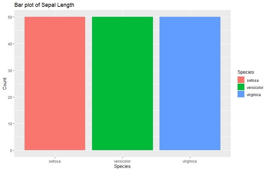
1. Bar Graphs
Bar graphs are the most mainstream kind of graphs used in analysis. They’re used whenever you want to compare the values of different categories using vertical bars representing the values. These bars of varying height make the comparison very convenient. Here’s an example viewing the sepal length of different species.
					ggplot(data=iris, aes(x=Species, fill = Species)) +
geom_bar() +
  xlab("Species") +
  ylab("Count") +
  ggtitle("Bar plot of Sepal Length")
2. Histograms
Histograms are very similar to bar plots. They are used to graphically view the continuous data and group them into bins. Each bar in a histogram has multiple bins with different colors which makes it easy to see the frequency of each individual category. Here’s how we can make them using ggplot2.
					ggplot(data=iris, aes(x=Sepal.Width)) +
  geom_histogram(binwidth=0.2, color="black", aes(fill=Species)) +
  xlab("Sepal Width") +
  ylab("Frequency") +
  ggtitle("Histogram of Sepal Width")

3. Box Plots
A box plot visualizes the overall data distribution in a very compact manner. With a single box, you can view both the upper and lower quartiles and any outliers present, along with the range of data spread.
Interested in how to read a box plot? Click here.
					ggplot(data=iris, aes(x=Species, y=Sepal.Length)) +
  geom_boxplot(aes(fill=Species)) +
  ylab("Sepal Length") + ggtitle("Iris Boxplot")

4. Scatter Plots
Last but not least, scatter plots are also very common and a useful way of viewing data. They’re widely used by data scientists to view any present correlation between a set of variables. They simply scatter all the points of a variable on a chart and if there’s any correlation between them, it becomes evident.
					ggplot(data=iris, aes(x = Sepal.Length, y = Sepal.Width)) + geom_point(aes(color=Species, shape=Species)) +
  xlab("Sepal Length") +  ylab("Sepal Width") +
  ggtitle("Sepal Length-Width")

Regression Analysis In R
Regression analysis refers to statistical processing where the relationship between the variables in a dataset are identified. We are mostly making out the relationship between the independent and dependent variables, but it doesn’t always have to be the case. This is another important function to do Advanced Analytics with R.
The idea of regression analysis is to help us to know how the other variable will change if we change one variable. This is precisely how regression models are built. There are different types of regression techniques we can use based on the shape of the regression line and the types of variables involved:
- Linear Regression
- Logistic Regression
- Multinomial Logistic Regression
- Ordinal Logistic Regression
Let’s have a closer look at what the different regression types are used for.

1. Linear Regression
This is the most basic type of regression and can be used where two variables have a linear relationship. Based on the values of the two variables, a straight line is modeled with the following equation:
Y = ax + b
Linear regression is used to predict continuous values where you just supply the value of the independent variable. You get the value of the dependent variable (y in this case) as a result.
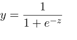
2. Logistic Regression
Logistic regression is the following regression technique used to predict values within a specific range. It can be used when the target variable is categorical, for example, predicting the winner or loser using some data. The following equation is used in logistic regression.
3. Multinomial Logistic Regression
As the name suggests, multinomial logistic regression is an advanced version of logistic regression. The difference between this and simple logistic regression is that it can support more than two categorical variables. Other than that, it uses the same mechanism as logistic regression.
4. Ordinal Logistic Regression
This as well is an advanced mechanism to the simple logistic regression, and it’s used to predict the values that exist on different category levels, for example, predicting the ranks. An example application of using ordinal logistic regression would be rating your experience at a restaurant.
Using Regression in R
Now, let’s see how we can do regression analysis in R. For demonstration, I would be creating a logistic regression model in R since it covers the concepts nicely.
Use Case: We will be predicting students’ success in an exam using their IQ levels.
Let’s generate some random IQ numbers to come up with our dataset.
					# Generate random IQ values with mean = 30 and sd =2
IQ <- rnorm(40, 30, 2)

# Sorting IQ level in ascending order
IQ <- sort(IQ)
Using the rnorm(), we have created a list of 40 IQ values that have a mean of 30 and a STD of 2.
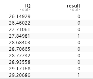
Now, we randomly created pass/fail values as 0/1 for 40 students and put them in a dataframe. Also, we will associate each value we create with an IQ so our dataframe is complete.
					# Generate vector with pass and fail values of 40 students
result <- c(0, 0, 0, 1, 0, 0, 0, 0, 0, 1,
1, 0, 0, 0, 1, 1, 0, 0, 1, 0,
0, 0, 1, 0, 0, 1, 1, 0, 1, 1,
1, 1, 1, 0, 1, 1, 1, 1, 0, 1)

# Data Frame
df <- as.data.frame(cbind(IQ, result))

# Print data frame
print(df)
Now, let’s create a regression model based on our dataset and create a curve to see how the regression model performs on it. We can use the glm() function to create and train a regression model and the curve() method to plot the curve based on prediction.
					# Plotting IQ on x-axis and result on y-axis
plot(IQ, result, xlab = "IQ Level",
ylab = "Probability of Passing")

# Create a logistic model
g = glm(result~IQ, family=binomial, df)

# Create a curve based on prediction using the regression model
curve(predict(g, data.frame(IQ=x), type="resp"), add=TRUE)

# This Draws a set of points
# Based on fit to the regression model
points(IQ, fitted(g), pch=30)
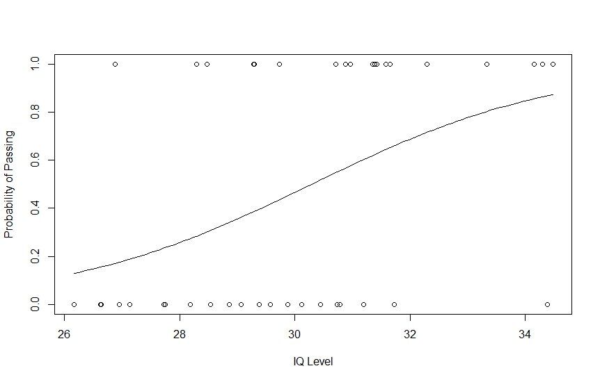
Moreover, if you want to check the logistic regression model’s statistics further, you can do so by running the summary() of R (summary(g)).
Time Series Forecast In R
Time Series Forecast is amongst the strongest suits of R. While Python is also quite famous for time series analysis, many experts still argue that R provides you with an overall better experience. The Forecast package is very comprehensive, and the best one could wish for Advanced Analytics with R.
In this article, we will be covering the following methods of Time Series Forecasting:
- Naïve Methods
- Exponential Smoothing
- BATS and TBATS
We’ll use the Air Passengers dataset present in R to create models on a validation set, forecast as far as the duration for the validation set goes, and finally obtain the Mean Absolute Percentage Error to complete the segment.
So, let’s initialize the data along with the training and validation window to get started.
					#  Time Series Forecast In R
install.packages("forecast")
install.packages("MLmetrics")
library(forecast)
library(MLmetrics)
data=AirPassengers
#Create samples
training=window(data, start = c(1949,1), end = c(1955,12))
validation=window(data, start = c(1956,1))
1. Naïve Methods
As the name suggests, the naïve method is the simplest of all forecasting methods. It is based on the simple principle of “what we observe today, will be the forecast tomorrow.” Seasonal naïve method is a bit complex variant where the observation period is according to the horizon we’re working with, e.g., week/month/year.
Let’s move forward with a seasonal naïve forecast.
					naive = snaive(training, h=length(validation))
MAPE(naive$mean, validation) * 100
Here, we can see an MAPE score of 27.05%. Let’s go ahead and plot this result.
MAPE score = Mean Absolute Percentage Error
					plot(data, col="blue", xlab="Year", ylab="Passengers", main="Seasonal Naive Forecast", type='l')
lines(naive$mean, col="red", lwd=2)
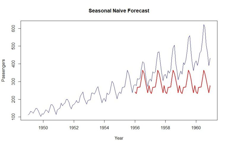
As you can see, last year’s dataset is simply repeated for the validation period. That’s a seasonal naïve forecast in a nutshell for you.
2. Exponential Smoothing
Exponential smoothing, in its essence, refers to giving reduced weight to observations. Like moving averages, the most recent observations get a higher weight, while the older ones gradually reduce in their weights, hence the importance.
The good thing about forecast package is that we can find the optimal exponential smoothing models through placing the smoothing methods inside the structure of space models.
					ets_model = ets(training, allow.multiplicative.trend = TRUE)
summary(ets_model)
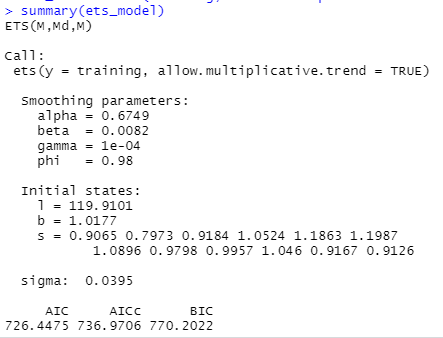
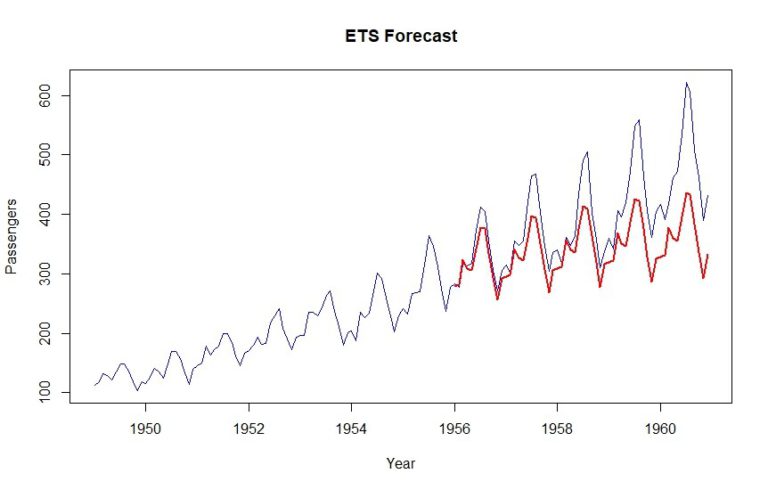
Now, we will plug in the estimated optimal smoothing model to our ETS forecast and see how it performs.
					ets_forecast = forecast(ets_model, h=length(validation))
MAPE(ets_forecast$mean, validation) *100
As a result, we get a MAPE of 12.6%. Also, it’s evident that the upward trend is being counted for a little bit.
3. BATS and TBATS
For the processes that have very complex trends, ETS is often not good enough. Sometimes, you can have both weekly and yearly seasonality, and this is where BATS and TBATS stands out, as it can handle multiple seasonalities at once.
Let’s build a TBATS model and do the forecasting.
					tbats_model = tbats(training)
tbats_forecast = forecast(tbats_model, h=length(validation))
MAPE(tbats_forecast$mean, validation) * 100

plot(data, col="blue", xlab="Year", ylab="Passengers", main="ETS Forecast", type='l')
lines(tbats_forecast$mean, col="red", lwd=2)
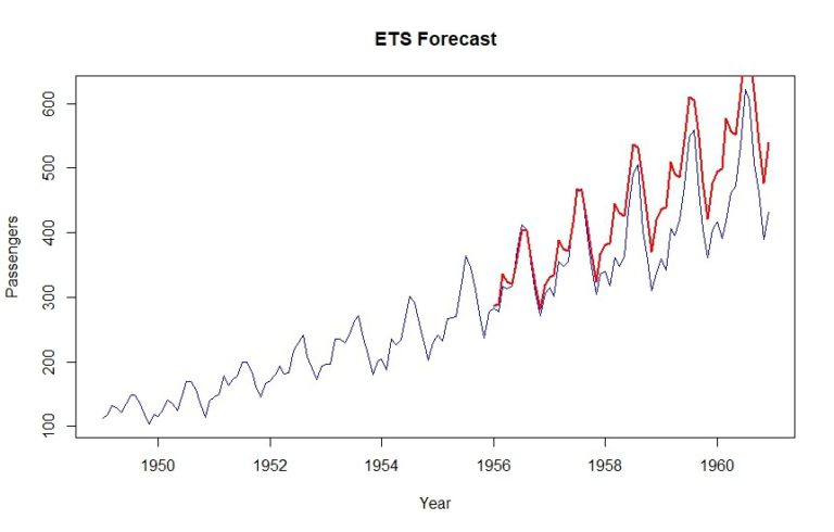
As you can see, a MAPE of 12.9% is achieved using this method.
Wrap Up
That’s all for today! We learned about advanced analytics in R focusing on plotting and different kinds of regression analytics and we further covered Time Series Forecast in R. However, Time Series is a pretty comprehensive topic in itself and we have only scratched the surface yet. So stay tuned, because we will cover Time Series in detail in the upcoming blogs.
Until then, happy R-ing guys!