This blog post is a submission for the Analytics Designer Hackathon.
More information about the hackathon can be found here: https://www.sap.com/idea-place/app-design-hackathon.html
Use case
Clinical Department analysis
Business case
The scope of responsibility of Chief Physicians has widened in recent years. Thus, they are not only responsible for medical quality but also need to manage staff, financial matters and cost accounting. Our solution assists Chief Physicians in handling their management tasks faster and more easily by giving them HR, Finance, Patient, Surgery and department´s data in one application, easily accessible and up-to-date.
Analytics need
The main objective for every hospital and clinical department is the high quality of medical results. In order to achieve this high quality, it is immensely important to receive real-time information regarding quality indicators, utilization and performance data as well as personal data in a clear, easy to monitor and easy to interpret way.
Target audience
Chief Physician (professional, personal and economic responsibility)
Application Structure
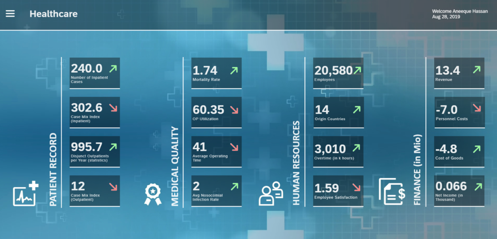
Landing Page / Overview
The landing page as a starting point provides important KPIs which are clustered in several sections.
Navigation/Interaction
The application provides multiple interaction and navigation possibilities to the user. The user can show or hide the menu on the upper left corner of the dashboard. The use of commonly used icons with straightforward semantic meaning for navigation makes it much easier for the users to find their way in the application.
The Navigation Menu provides the following possibilities:
- Reset filters and return to the landing page
- Set Dashboard-wide filters
- Launch Data Exploration
- Launch Smart Predict
- Save the current selection as a bookmark
- See Dashboard information

Details Dashboards
Each KPI tile on the landing page links to the view with the detailed information about this KPI. Depending on the KPI the Chief Physician can analyze plan data, compare along with different years and characteristics, as for example Hospital name.
Example KPI “Employees”: by clicking on the KPI ‘Employees’ the user can find information about employees, like the number of employees in each area or degree of satisfaction. This allows the Chief Physician to identify fields of interest and help him to develop actions to improve these KPIs if needed.
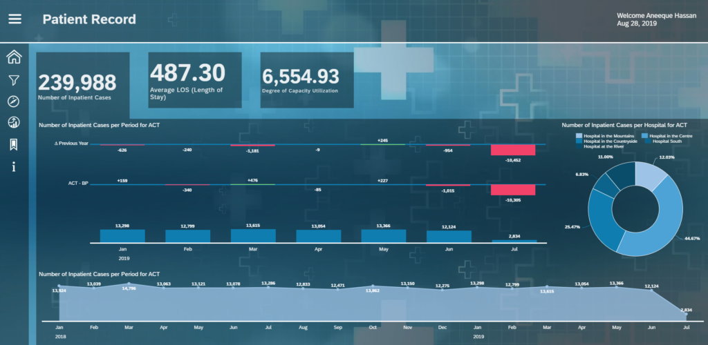
Having information available from heterogenous sources and on a different level of granularity enables the User to compare different aspects at one time and identify potential hidden dependencies.
For example, a constantly high rate of bed utilization over a long time span at different institutions may not only require the acquisition of more beds but also call for an increase in staff members.
Filtering
The application by default shows the data for a whole clinical group. In this group, there is more than one hospital. If management team users want to have a look at a specific hospital, they can further filter the dataset to a certain hospital and find related information.
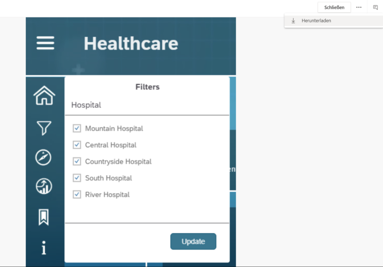
This enables the management team of the whole group to see big picture along with details on a certain hospital. They can also select multiple hospitals from the filters to make a combined analysis of certain hospital.
Information Areas
The dashboards display information on the following important silos.
- Patient Information
- Quality Information
- Employee Information
- Financial Information
The detailed areas show comparisons for different KPIs based on different characteristics. Some of the detail pages also show how the KPI has developed over the period of the last few years. This gives naturally the opportunity to the management to plan the extension in the group in time.
Acting quickly to very fast-changing requirements in the health care sector can improve the whole health care system enormously for the people.
Interested?
Did I manage to get your attention?
Me and my colleagues would be happy to talk to you about the Best Practice approach to SAC Dashboarding. Let us start with a one-day workshop where we will touch all above-mentioned topics.
- Website: SAP Analytics Cloud
- Blog: Best Practice Dashboard with SAP Analytics Cloud (SAC)
- Blog: Wie Business Analytics erfolgreich gestalten?
- Blog: Business Analytics vs. Business Intelligence
- Blog: Was ist SAP Analytics? Das SAP Data Warehouse-Portfolio
- Blog: SAP Analytics – Die Front End Produkte
- Webinar: Simplify Planning & Scenario-based Forecasting with one Cloud Solution
- Webinar: Augmented Analytics – Insights und Entscheidungsprozesse selbst in die Hand nehmen
- Webinar: Challenging Times for Finance & Controlling Dashboards, Augmented Analytics and Planning